Chart dimensions, contexts, and families
While Netdata's charts require no configuration and are easy to interact with, they have a lot of underlying complexity. To meaningfully organize charts out of the box based on what's happening in your nodes, Netdata uses the concepts of dimensions, contexts, and families.
Understanding how these work will help you more easily navigate the dashboard, write new alarms, or play around with the API.
For a refresher on the anatomy of a chart, see dashboards and charts.
Dimension#
A dimension is a value that gets shown on a chart. The value can be raw data or calculated values, such as the
average (the default), minimum, or maximum. These values can then be given any type of unit. For example, CPU
utilization is represented as a percentage, disk I/O as MiB/s, and available RAM as an absolute value in MiB or
GiB.
Beneath every chart (or on the right-side if you configure the dashboard) is a legend of dimensions. When there are multiple dimensions, you'll see a different entry in the legend for each dimension.
The Apps CPU Time chart (with the context apps.cpu), which visualizes CPU utilization of
different types of processes/services/applications on your node, always provides a vibrant example of a chart with
multiple dimensions.
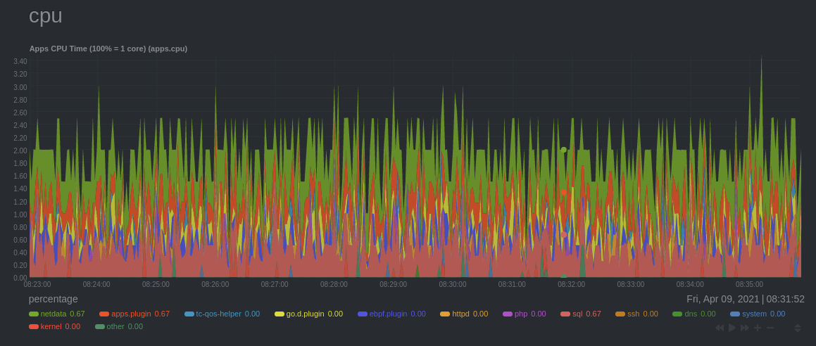
The chart shows 13 unique dimensions, such as httpd for the CPU utilization for web servers, kernel for anything
related to the Linux kernel, and so on. In your dashboard, these specific dimensions will almost certainly be different.
Dimensions can be hidden to help you focus your attention.
Context#
A context is a way of grouping charts by the types of metrics collected and dimensions displayed. It's kind of like a machine-readable naming and organization scheme.
For example, the Apps CPU Time has the context apps.cpu. A little further down on the dashboard is a similar
chart, Apps Real Memory (w/o shared) with the context apps.mem. The apps portion of the context is the type,
whereas anything after the . is specified either by the chart's developer or by the family.
By default, a chart's type affects where it fits in the menu, while its family creates submenus.
Netdata also relies on contexts for alarm configuration (the on
line).
Family#
Families are a single instance of a hardware or software resource that needs to be displayed separately from similar instances.
For example, let's look at the Disks section, which contains a number of charts with contexts like disk.io,
disk.ops, disk.backlog, and disk.util. If your node has multiple disk drives at sda and sdb, Netdata creates
a separate family for each.
Netdata now merges the contexts and families to create charts that are grouped by family, following a
[context].[family] naming scheme, so that you can see the disk.io and disk.ops charts for sda right next to each
other.
Given the four example contexts, and two families of sda and sdb, Netdata will create the following charts and their
names:
| Context | sda family | sdb family |
|---|---|---|
disk.io | disk_io.sda | disk_io.sdb |
disk.ops | disk_ops.sda | disk_ops.sdb |
disk.backlog | disk_backlog.sda | disk_backlog.sdb |
disk.util | disk_util.sda | disk_util.sdb |
What's next?#
With an understanding of a chart's dimensions, context, and family, you're now ready to dig even deeper into Netdata's dashboard. We recommend looking into using the timeframe selector.
If you feel comfortable with the dashboard and interacting with charts, we recommend learning about configuration. While Netdata doesn't require a complicated setup process or a query language to create charts, there are a lot of ways to tweak the experience to match your needs.