Overview
The Overview is one way to monitor infrastructure using Netdata Cloud. While the interface might look similar to local dashboards served by an Agent, or even the single-node dashboards in Netdata Cloud, Overview uses composite charts. These charts display real-time aggregated metrics from all the nodes (or a filtered selection) in a given War Room.
With Overview's composite charts, you can see your infrastructure from a single pane of glass, discover trends or anomalies, then drill down by grouping metrics by node and jumping to single-node dashboards for root cause analysis.

Before you get started#
Only nodes with v1.25.0-127 or later of the the open-source Netdata monitoring agent can contribute to composite charts. If your node(s) use an earlier version of Netdata, you will see them marked as needs upgrade in various dropdowns.
See our update docs for the preferred update method based on how you installed Netdata.
Composite charts#
The Overview uses composite charts, which aggregate metrics from all the nodes (or a filtered selection) in a given War Room.
Definition bar#
Each composite chart has a definition bar to provide information about the aggregate function, dimension, and nodes related to that chart.
Below is an example definition bar for the system.cpu_pressure chart, which visualizes situations where tasks are
stalled on CPU. This definition bar informs you that the chart is using the average aggregate function on all
dimensions, with 5 contributing charts from 5 contributing nodes, 0 errors, and that the composite chart
is visualizing metrics per dimension.

Aggregate functions#
Each chart uses an opinionated-but-valuable default aggregate function. For example, the system.cpu chart shows the
average for each dimension from every contributing chart, while the net.net chart shows the sum for each dimension
from every contributing chart, which can also come from multiple networking interfaces.
The following aggregate functions are available for each selected dimension:
- Average: Displays the average value from contributing nodes. If a composite chart has 5 nodes with the following
values for the
outdimension—-2.1,-5.5,-10.2,-15,-0.1—the composite chart displays a value of−6.58. - Sum: Displays the sum of contributed values. Using the same nodes, dimension, and values as above, the composite
chart displays a metric value of
-32.9. - Min: Displays a minimum value. For dimensions with positive values, the min is the value closest to zero. For charts with negative values, the min is the value with the largest magnitude.
- Max: Displays a maximum value. For dimensions with positive values, the max is the value with the largest magnitude. For charts with negative values, the max is the value closet to zero.
Dimensions#
Select which dimensions to display on the composite chart. You can choose All dimensions, a single dimension, or any number of dimensions available on that context.
Charts#
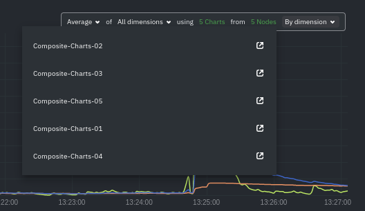
Click on X Charts to display a dropdown of charts and nodes contributing to that composite chart. Each line in the dropdown displays a chart name and the associated node's hostname.

Nodes#
Click on X Nodes to display a dropdown of nodes contributing to that composite chart. Each line displays a hostname to help you identify which nodes contribute to a chart.
If one or more nodes can't contribute to a given chart, the definition bar shows a warning symbol plus the number of
affected nodes, then lists them in the dropdown along with the associated error. Nodes might return errors because of
networking issues, a stopped netdata service, or because that node does not have any metrics for that context.
Group by dimension, node, or chart#
Click on the By dimension dropdown to change how a composite chart groups metrics.

The default is by dimension, so that each line/area in the visualization is the aggregation of a single dimension.

A composite chart grouped by node visualizes a single metric across contributing nodes. If the composite chart has 5 contributing nodes, there will be 5 lines/areas, one for the most relevant dimension from each node. Grouping by nodes allows you to quickly understand which nodes in your infrastructure are experiencing anomalous behavior.

A composite chart group by chart visualizes each instance of a chart as a separate dimension. By grouping the
disk.io chart by chart, you can visualize the activity of each disk on each node that contributes to the composite
chart.

Reset to defaults#
Click on the 3-dot icon (⋮) on any chart, then Reset to Defaults, to reset the definition bar to its initial state.
Jump to single-node dashboards#
Click on X Charts/X Nodes to display one of the two dropdowns that list the charts and nodes contributing to a given composite chart. For example, the nodes dropdown.
To jump to a single-node dashboard, click on the link icon  next to the
node you're interested in.
next to the
node you're interested in.
The single-node dashboard opens in a new tab. From there, you can continue to troubleshoot or run Metric Correlations for faster root cause analysis.
Add composite charts to a dashboard#
Click on the 3-dot icon (⋮) on any chart, then click on Add to Dashboard. Click the + button for any dashboard you'd like to add this composite chart to, or create a new dashboard an initiate it with your chosen chart by entering the name and clicking New Dashboard.
Interacting with composite charts: pan, zoom, and resize#
You can interact with composite charts as you would with other Netdata charts. You can use the controls beneath each chart to pan, zoom, or resize the chart, or use various combinations of the keyboard and mouse. See the chart interaction doc for details.
Menu#
The Overview uses a similar menu to local Agent dashboards and single-node dashboards in Netdata Cloud, with sections and sub-menus aggregated from every contributing node. For example, even if only two nodes actively collect from and monitor an Apache web server, the Apache section still appears and displays composite charts from those two nodes.
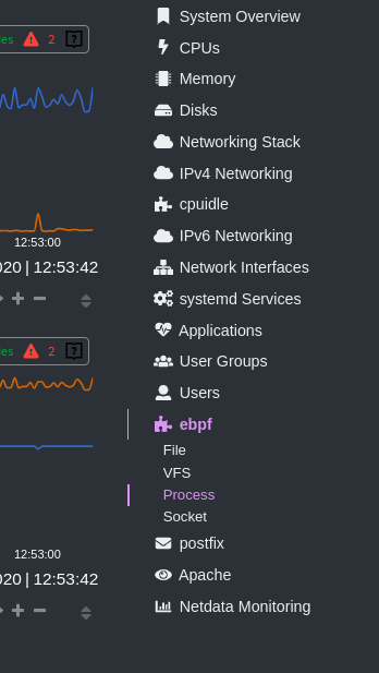
One difference between the Overview's menu and those found in single-node dashboards or local Agent dashboards is that the Overview condenses multiple services, families, or instances into single sections, sub-menus, and associated charts.
For services, let's say you have two concurrent jobs with the web_log collector, one for Apache and another for Nginx. A single-node or local dashboard shows two section, web_log apache and web_log nginx, whereas the Overview condenses these into a single web_log section containing composite charts from both jobs.
The Overview also consdenses multiple families or multiple instances into a single all sub-menu and associated
charts. For example, if Node A has 5 disks, and Node B has 3, each disk contributes to a single disk.io composite
chart. The utility bar should show that there are 8 charts from 2 nodes contributing to that chart.
This action applies to disks, network devices, and other metric types that involve multiple instances of a piece of hardware or software. The Overview currently does not display metrics from filesystems. Read more about families and instances
Persistence of composite chart settings#
When you change a composite chart via its definition bar, Netdata Cloud persists these settings in a query string attached to the URL in your browser. You can "save" these settings by bookmarking this particular URL, or share it with colleagues by having them copy-paste it into their browser.
What's next?#
For another way to view an infrastructure from a high level, see the Nodes view.
If you need a refresher on how Netdata's charts work, see our doc on interacting with charts.
Or, get more granular with configuring how you monitor your infrastructure by building new dashboards.